

What Contrast Does Website Text Need to Be Readable?
Ordinary text needs a contrast ratio of at least 4.5:1. What the bar is, who faint text affects, and how to tell in a few minutes whether your own site clears it.
Rick Hensbergen3 minute read
Light gray text on a white page looks clean in a design file. On a phone in a parking lot, or for someone with low vision, it can be hard to read at all. The Web Content Accessibility Guidelines (WCAG) set a minimum for how much the text has to stand apart from its background, and it is the barrier Esther finds most often.
The number: 4.5 to 1
WCAG measures contrast as a ratio between the brightness of the text and the brightness of the background, from 1:1 (the same color) to 21:1 (black on white). Ordinary text needs at least 4.5:1. Large text needs at least 3:1: roughly 24 pixels and up, or about 19 pixels in bold. Logos and text that is purely decorative are exempt.
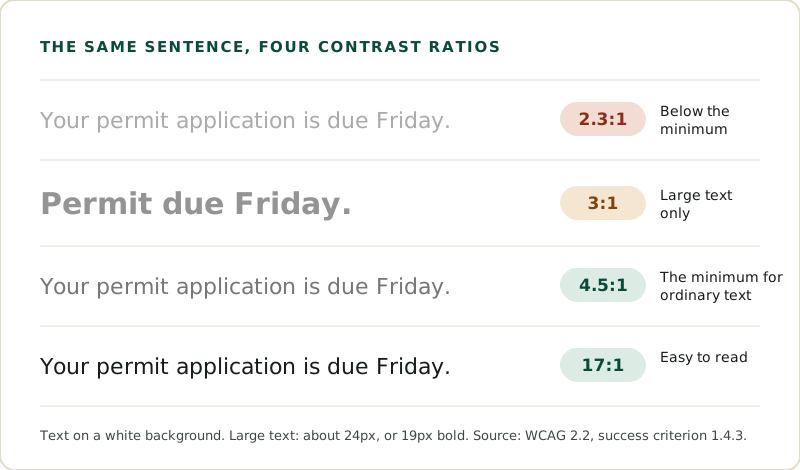
The bar is the same for every site. What differs is how close each site's colors come to it, and that is decided mostly by a handful of choices: the body text color, the gray used for captions and hints, and any text that sits on a colored panel or a photo.
How common it is
Between July 8 and October 5, 2026, Esther found body text too faint to read comfortably on 98% of the government websites it assessed. It was the most common barrier of all, and it is on the page before a resident clicks anything (Who is affected by inaccessible government websites?). On 77% of those sites, buttons and other controls were faint too, a related check with its own lower bar of 3:1.
Contrast is also the criterion with the longest record in court, which makes it the most widespread barrier and the most legally settled one at the same time (How much work is it to fix website accessibility?).
Who it affects
People with low vision feel it first, and so do many older readers, since contrast sensitivity falls with age. Anyone reading a phone outdoors in bright light meets the same problem. The text is still there; reading it takes effort it shouldn't, and on a form or a notice that effort is where mistakes happen.
Why the fix is usually small
Faint text almost always comes from a shared style rather than from one page. The same gray is set once, for captions or form hints or the footer, and every page built from that style carries it. Darkening that one color in the shared style clears the barrier everywhere it appears. It is the same pattern Esther found across whole sites, where a typical site's 1,746 barriers traced back to 34 changes.
Three questions about your own site
- Does your main body text clear 4.5:1 against its background? A free contrast checker gives the ratio from two color codes, and the person who manages the site's styles can read those codes off in a minute.
- What about the lighter text: captions, form hints, placeholder text, and the footer? These are where faint gray usually hides, because they were designed to look secondary.
- Is any text sitting on a photo or a colored panel? The ratio has to hold against the background behind every letter, which a photo rarely gives.
A *no* to any of them is usually one color in one shared style.
For what this means for a public body, see ADA compliance for government. For a business, see ADA compliance for business.
The 98% and 77% figures cover government websites Esther assessed between July 8 and October 5, 2026.
About the author

Rick Hensbergen is the founder and CEO of Esther. He spent twenty years leading software testing and quality teams for major banks in the United States and the United Kingdom.